도전2022

안드로이드 타이포그래피 본문

작업/work2014

안드로이드 타이포그래피

hotdigi 2014. 11. 27. 00:40

http://www.google.com/design/spec/style/typography.html#typography-standard-styles


Typography

Roboto and Noto

Since the Ice Cream Sandwich release, Roboto has been the standard typeface on Android. Since Froyo, Noto has been the standard typeface on Android for all languages not covered by Roboto. Noto is also the standard typeface for all languages on Chrome OS.

To support all languages worldwide, Google recommends using Roboto for languages that use the Latin, Greek, and Cyrillic scripts and Noto for all other languages.


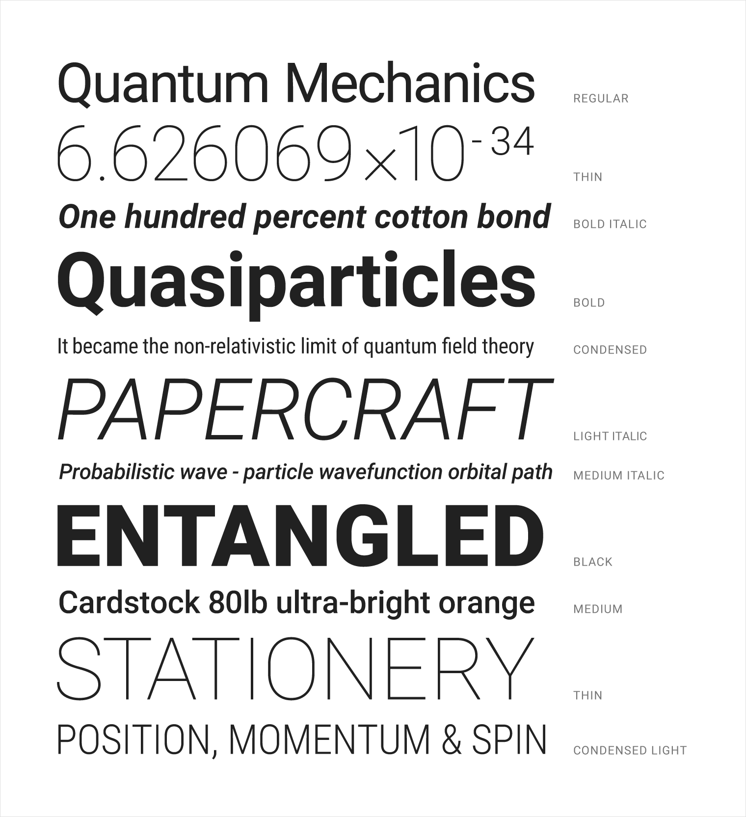
Roboto has been refined extensively to work across the wider set of supported platforms. It is slightly wider and rounder, giving it greater clarity and making it more optimistic.

Examples of Roboto

Roboto A-Z and numerals

Noto’s vertical metrics are compatible with Roboto.

Noto Sans CJK
Noto Sans Thai and Devanagari

Language coverage

Roboto supports languages that use the Latin, Greek, and Cyrillic scripts, such as English, French, Greek, and Russian. In addition, Roboto has been extended to completely cover all Latin, Greek, and Cyrillic characters as defined in Unicode 7.0. The number of supported characters has doubled from previous releases, from about 2000 to about 4000 characters.

Noto covers all major living languages languages, including English, Greek, Russian, Arabic, Hebrew, Chinese, Japanese, and Korean (CJK), Hindi, Bengali, Georgian, Armenian, Thai, Lao, Khmer, and many others.

Font weights

Roboto has six weights: Thin, Light, Regular, Medium, Bold, and Black.

Roboto font weights

Noto Sans CJK has seven weights: Thin, Light, DemiLight, Regular, Medium, Bold, and Black. The weight of Noto Sans CJK Regular is the same as Roboto Regular.

Noto Sans CJK font weights

Noto fonts for Thai, Devanagari, and all other major living languages have Regular and Bold weights.

Noto Thai and Devanagari font weights

Hinted fonts

Hints are the instructions embedded in a font on how to modify (distort) a glyph to look better on low-resolution displays. As a tradeoff, a hinted font consumes more space than the unhinted version.

Both Roboto and Noto have hinted and unhinted versions. Google recommends:

  • Use the unhinted versions on Android and on Mac OS X, which doesn’t implement hints.
  • Use hinted fonts on Chrome OS, Windows, and Linux.

Font Stack

For both Android and web properties, the font stack should specify Roboto, Noto, and then sans-serif.

Standard styles

Typographic guidelines are provided for three categories of language scripts:

  • English and English-like: Latin (except Vietnamese), Greek, Cyrillic, Hebrew, Armenian and Georgian
  • Tall: Language scripts that require extra line height to accommodate larger glyphs. Includes South and Southeast Asian and Middle-Eastern languages, like Arabic, Hindi, Telugu, Thai, Vietnamese.
  • Dense: Language scripts that require extra line height to accommodate larger glyphs but have different metrics from tall scripts. Includes Chinese, Japanese, and Korean.

Typographic scale & basic styles

Too many type sizes and styles at once can wreck any layout. A typographic scale has a limited set of type sizes that work well together along with the layout grid. The basic set of styles are based on a typographic scale of 12, 14, 16, 20 and 34.

English-like: These sizes and styles are chosen to balance content density and reading comfort under typical usage conditions. Type sizes are specified with sp (scaleable pixels) to enable large type modes for accessibility.

Tall:

  • Weight: Use Regular weight, as Medium weight is unavailable in Noto. In addition, Google recommends avoiding Bold weight, based on feedback from native speakers that Bold is too heavy.
  • Font size: For Title through Caption styles, font size is 1 px larger than that specified for English. For styles larger than Title, the English type size is suitable.

Dense:

  • Weight: Since Noto CJK has seven weights that match Roboto, use the same weight settings as English.
  • Font size: For Title through Caption styles, the font size is 1 px larger than that specified for English. For styles larger than Title, the English type size is suitable.

Examples using Display style.

Examples using Headline style.

English and English-like: Across form factors, text that appears in the app bar should use the Title style, Medium 20sp.

Examples using Title style.

There are certain scenarios where the larger Subhead style should be used instead of the smaller Body style. Some of those instances include when information is presented as small snippets or when titles are paired with lines of Body-styled text.

Examples using Subhead style.

Examples using Body style.

Examples using Body style.

Button style (Medium 14sp, all caps) is used for all buttons, whether they are ink or material.

Examples using Button style.

Basic colors & color contrast

Of course, text that is the same color as the background is hard to read. Text with too much contrast can dazzle and also be hard to read. This is especially true of light-colored text against dark backgrounds.

Text should maintain a minimum contrast ratio of at least 4.5:1 (calculated based on luminance values) for legibility. A ratio of 7:1 is preferred.

These color combinations also consider contrast ratios for users with an atypical color response.

Large type and dynamic type

For the best user experience, use dynamic type instead of relying only on smaller type sizes or allowing truncation of larger-size text.

Large type applied correctly can make apps more interesting, differentiate layouts, and help users to decode content quickly.

Dynamic type enables large type when the length of the text in a layout is unknown. Dynamic sizes are selected from a typographic scale based on available space and letter size estimates.

Dynamic type

Line height

To achieve proper readability and appropriate pacing, line heights have been determined based on each style’s individual size and weight. Line wrapping only applies to Body, Subhead, Headline, and the smaller Display styles. All other styles should exist as single lines.

English and English-like: see image.

  • Tall:
    Line height is 0.1 em larger for Body 1 and Subhead 1. In English and English-like scripts, a gap between lines is an obvious straight white space. In the tall group of scripts, this gap is not sufficient. For Body 1 and Subhead 1, which have a relatively small line height in English, the lack of space is obvious. Therefore, the gap needs to be increased to ensure a line gap that is visually similar to English-like scripts.
  • Very small line heights for Title and larger styles are adjusted to avoid clipping between characters with low descenders in one line and character with tall ascenders in the next line.

Dense:
Line height is 0.1 em larger for all styles. CJK ideographic characters use the entire em box, while English mostly uses a portion of the em box—often the lower portion below the x-height. Therefore, the actual gap between lines is smaller for CJK when the same line height is set. To achieve the same design intention as English for CJK, the line height needs to be larger than in English.

English and English-like type and leading

Pairing examples
Isolated examples — Increased line height

Line breaking rules/hyphenation

Do.
Don't.

Characters and line length

Consider this advice on readability and line length from the Baymard Institute:

“You should have around 60 characters per line if you want a good reading experience. Having the right amount of characters on each line is key to the readability of your text.”

"Too wide – if a line of text is too long the user’s eye will have a hard time focusing on the text. This is because the length makes it difficult to get an idea of where the line starts and ends. Furthermore it can be difficult to continue from the correct line in large blocks of text.”

"Too narrow – if a line is too short the eye will have to travel back too often, breaking the reader’s rhythm. Too short lines also tend to stress people, making them begin on the next line before finishing the current one (hence skipping potentially important words).”

Source: “Readability: the Optimal Line Length,”

http://baymard.com/blog/line-length-readability

Tracking and kerning


'작업 > work2014' 카테고리의 다른 글

안드로이드 Roboto & Noto fonts  (0) 2014.11.27
안드로이드 레이아웃 템플릿  (0) 2014.11.27
안드로이드 아이콘  (0) 2014.11.27
안드로이드 컬러  (0) 2014.11.27
안드로이드 멀티플 스크린  (0) 2014.11.27