
Product icons are the visual expression of a brand’s products, services, and tools. Simple, bold, and friendly, they communicate the core idea and intent of a product. While each product icon is visually distinct, all product icons for a given brand should be unified through concept and execution.
Product icons are an essential vehicle for communicating your brand. Using these guidelines as a starting point, make sure your product icon colors and other key elements reflect your brand identity.

Design approach
Product icon design is inspired by the tactile and physical quality of material. Each icon is cut, folded, and lit as paper would be, but represented by simple graphic elements. The quality of the material is sturdy, with clean folds and crisp edges. The matte-like finish interacts with light through subtle highlights and consistent shadows.


Product icon grid
The product icon grid has been developed to facilitate consistency and establish a clear set of rules for the positioning of graphic elements. This standardization results in a flexible but coherent system.
Keyline shapes
Keyline shapes are the foundation of the grid. By using these core shapes as guidelines, you can maintain a consistent visual proportion across related product icons.

Height: 152
Width: 152

Diameter: 176
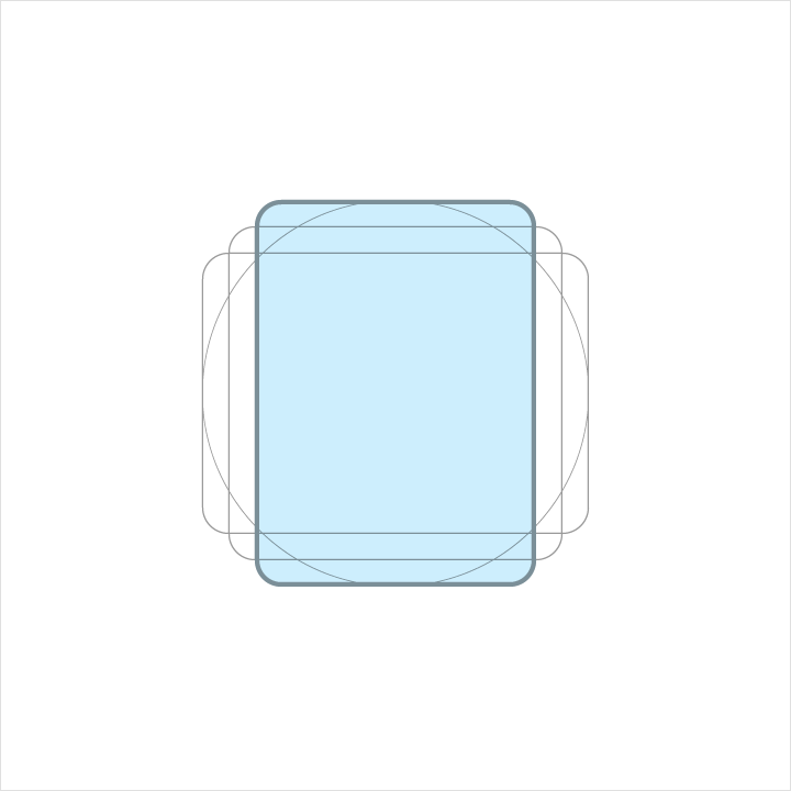
Height: 176
Width: 128

Height:128
Width:176
DP unit grid
Device launchers display product icons at 48dp. When you create the icon, maintain the 48-unit measure, but scale it to 400% at 192 x 192 px.
By maintaining the unit ratio, you preserve sharp edges and correct alignment when the scale is reduced.


Geometry
Preset standards have been determined for specific keylines: circle, square, rectangle, orthogonals, and diagonals. This small palette of universal and simple elements has been developed to unify product icons and systemize their placement on the grid.


Product icon anatomy
Product icon anatomy describes the graphic elements that make up a product icon. The consistency of these elements across icons for a given brand is critical in maintaining a shared visual language. Familiarity with these elements makes it easier to understand characteristics of each logo and subtle differences between them. It will also help educate your eye to recognize the underlying structure of logo designs.
1. Finish
2. Material background
3. Material foreground
4. Color
5. Shadow

Each component is positioned on top of the previous one, always viewed from straight above.

An exploded perspective example illustrating the context of each component of the logo construction.

The back-most material element.

A material element raised above, and casting a shadow upon, the material background.

Color applied to a small portion of an element.

Color applied to an entire element, edge-to-edge.

The top edge of a material element. A tint is the mixture of a color with white, which lightens the original color.

The bottom edge of a material element. Shade is the mixture of a color with a darker hue, which darkens the original color.

A soft shadow around all edges of a raised material element.

A soft tint above all elements to provide surface lighting, fading from upper-left to lower-right.
Product icon metrics
Lighting
Within the material environment, virtual lights illuminate the scene and allow objects to cast shadows. A top light cast on material elements creates a contact shadow while highlighting the top and bottom edges. An angled light reinforces the sense of surface across the elements.


Shadows
For a product icon, the top light from above casts a soft shadow surrounding an element lightly on the top and left. The shadow is slightly heavier below and to the right. This shadow is always contained within the icon’s silhouette.

Mode: Normal
Opacity: 20%
X Offset: 0px
Y Offset: 6px
Blur: 6px
Color: Refer to Tint, shade and shadow values
Edge tint and shade
The top and bottom edges of material elements provide a sense of depth and surface. Material elements have a standard 1dp thickness. All edge distances are measured from an element's interior edge.
Tint highlights the top edge of all elements. The left, right, and bottom edges do not have a tint applied.
Shade darkens the bottom edge of all elements. The left, right, and top edges do not have a shade applied.

Height: 1dp
Opacity: 20%
Color: White (#FFFFFF)

Height: 1dp
Opacity: 20%
Color: Refer to Tint, shade and shadow values
Finish
The finish layer is a result of the virtual 45º light source. It extends from the top-left corner to the exterior edge of the icon’s silhouette. The finish is always contained within these boundaries.

Type: Radial
Angle: 45º
Color: White (#FFFFFF)
Midpoint Location: 33%
Slider 1
Opacity: 10%
Location: 0%
Slider 2
Opacity: 0%
Location: 100%
Tint, shade, and shadow values
Each color reacts differently when tints and shades are added. The color or every edge tint, edge shade, and shadow need to be adjusted for each color that lies behind it. To ensure color harmony, follow the appropriate value for each.


Product icon patterns
Influenced by the behavior of physical material, simple conventions provide a sense of surface and tactility. The interactions of material and color allow for numerous unique compositions.
Color
Color elements are flush to the paper’s surface.
Don’t embellish color elements with any edges or shadows.


Layer
Layered paper elements create depth, having edges and shadows.
Don’t exceed more than two layers. Having too many complicates the icon and lacks focus.


Dog-ear
A folder corner, or dog-ear, is used with forms associated with documents or traditional paper-based metaphors.
Don’t use a dog-ear treatment in the upper-left of an icon. The cast shadow from this position interrupts the harmony of the icon.


Elevate
Elevating a key material element atop a simple background silhouette focuses attention to the center.
Don’t crop elevated material elements within another shape.


Score
Scored material elements have the illusion of depth without losing their geometric form. Scores should be centered on symmetrical shapes.
Don’t use multiple scores, or position a score off-center.


Fold
Folded material elements are skewed, having greater dimension. Spot colors should be avoided, so as to avoid altering or misrepresenting key elements.


Overlap
Overlapped material elements create unique silhouettes. All elements, edges, and shadows are confined to the interior of the silhouette.
Don’t exceed more than two overlaps. Having too many complicates the icon and lacks focus.


Accordion
Accordion folded material elements are adjoined by a connecting fold, used to add dimension to a single material element.
Don’t exceed more than two accordion folds. Having too many complicates the icon and lacks focus.


Distort
Product icons should never be distorted or transformed. Elements should remain in their geometric form, and not be skewed, rotated, bowed, warped, or bent.

