Introduction
During the development of an application I often faced the necesity of a simple control to search a pick up a selection without much effort.
There are many possibilities to accomplish this, but it is always tedious and often you need to jump to a different form or write a lot of controls and aspx code which results ugly and not very obvious in designer mode what are you trying to accomplish let alone difficult to maintain. I started designing a pupup control where user can complete a search can get the results from the pupup control to the main page, user can define the html templates for the input search controls.The control can be used to search information for instance regarding departments or employees, the only difference will be the data source and the search template.
User can define the columns to show and the columns to be availables for data selection.
In addtional to the LookUp control I also sharing a control which I developed based on this first one, it has the basic functionality of a standar ComboBox, but with the feature of multi-column and multi-selection.
I've been seen many articles of people looking for a solution for a multi-column and multi-selection drop-down control.
These controls can be nested in other controls containers and well as nested in ajax updated panels.
Suport cross browers IE, Firefox, and Chrome.
Using the code (Lookup Search)
Having as TextBox which you need to populate either with a specific value being pulled from a search or with many values, this can be accomplish the as so:
Example:

<asp:TextBox ID="TextBox2" runat="server" Width="120px"></asp:TextBox>

<lu:LookUp ID="LookUp2" runat="server"
  DataKeyNames="OuCode,OuDescription,LM" DataSourceID="ObjectDataSource2"
  ExtenderEnabled="False" HtmlTemplate="~/luTemplates/OuSearch2.htm"
  TargetControlId="TextBox2" Width="16px" OnOnRowClick="LookUp2_OnRowClick"
  Height="16px" TitlePopUp="Test No 2"
  FadeDelay="3" WHeight="500">
<ItemTemplate>
    <lu:LuTemplate ID="LuTemplate7" runat="server" CssClass="LU_CellLeft">
        <HeaderText>Ou Code</HeaderText>
        <Template>
            <asp:Label ID="Label100" runat="server"
               Text='<%# DataBinder.Eval(Container.DataItem, "OuCode")%>' />
        </Template>
    </lu:LuTemplate>
    <.................................../>
    <lu:LuTemplate ID="LuTemplate12" runat="server" CssClass="LU_CellBox">
        <HeaderText>Changed on</HeaderText>
        <Template>
            <asp:Label ID="Label104" runat="server"
              Text='<%# DataBinder.Eval(Container.DataItem, "LastChange","{0:d}")%>' />
        </Template>
    </lu:LuTemplate>
</ItemTemplate>
</lu:LookUp>
The control has an event hander returning a DataTable with results of the selected items.
protected void LookUp2_OnRowClick(object sender, LookUpSearch.LookUp.RowData e)
{
    TextBox2.Text = string.Empty;

    if (e.DataTable.Rows.Count > 0)
    {
        foreach (DataRow row in e.DataTable.Rows)
        {
            TextBox2.Text = string.Format("{1},{0}",
              ((LookUpSearch.LookUp)(sender)).TargetTextBox.Text,row["OuCode"]);
        }
        TextBox2.Text = TextBox2.Text.TrimEnd(',');
        Oudescripion2.Text = e.DataTable.Rows[0]["OuDescription"].ToString();
        Lm2.Text = e.DataTable.Rows[0]["LM"].ToString();
    }
}
User can define html templates with the input contros to define the search criteria, the name of the input controls must match with the names of the parameters in the ObjectDataSource.

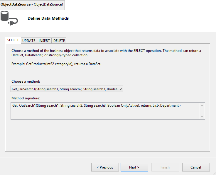
Get_OuSearch1 Method
public List<Department> Get_OuSearch1(string search1, string search2, string search3, bool OnlyActive)
{
    List<Department> list = GenData();
    return list.Select(s => new Department
    {
	OuCode = s.OuCode,
	OuDescription = s.OuDescription,
	LM = s.LM,
	LMName = s.LMName,
	LastChange = s.LastChange,
	Active = s.Active
    }).OrderBy(o => o.OuCode).ToList<Department>();
}
Result:

Using the code (JmComboBox)
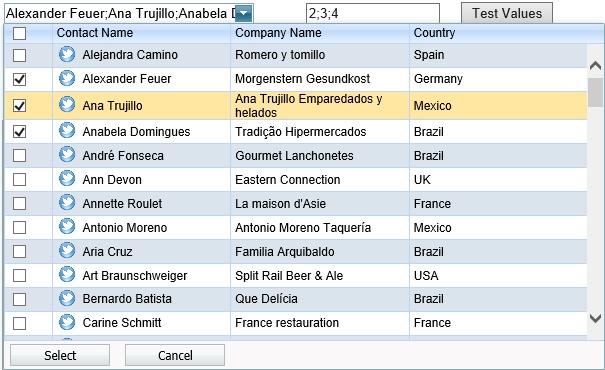
The JmComboBox can be single or multi selection, it is very similar to the Lookup control, but this control does not use different template, user can define the presentation of the culumns directly in the control template as well as define the Keys or Fields desired to be available when user complete the selection.
A combo box, which is represented by the JmComboBox control, is an editor that combines the functionality of a single-line text editor and dropdown list editor. The editor's dropdown displays a list of items which can be selected by end-users.
<jmcb:MultiComboBox ID="MultiComboBox3" runat="server" CssClass=""
     DataSourceID="ObjectDataSource1" DataTextField="ContactName"
     DataValueField="Id" Height="18px" TextFormatString="{0} - {1} - {2}"
     Width="250px" LayoutWidth="500" LayoutHeight="300"
     DataKeyNames="Country" MaximumEntries="50">
 <columns>
    <jmcb:ColumnField ID="LuTemplate3" runat="server"
            CssClass="CB_CellLeft" Width="100px">
        <HeaderText>Contact Name</HeaderText>
        <FieldTemplate>
            <table width="100%">
                <tr>
                    <td style="width: 18px; padding-right: 6px;"><img
                      src="twitter-icon.png" style="width: 18px; height: 18px"
                      alt=""/></td><td style="
                      text-align: left;"><%# DataBinder.Eval(
                         Container.DataItem, "ContactName")%></td>
                </tr>
            </table>
        </FieldTemplate>
    </jmcb:ColumnField>
    <jmcb:ColumnField CssClass="CB_CellLeft" Width="100px">
    <HeaderText>Company Name</HeaderText>
    <FieldTemplate>
        <%# DataBinder.Eval(Container.DataItem, "CompanyName")%>
    </FieldTemplate>
</jmcb:ColumnField>
    <jmcb:ColumnField CssClass="CB_CellBox" Width="100px">
    <HeaderText>Country</HeaderText>
    <FieldTemplate>
        <asp:Label ID="Label4" runat="server"
          Text='<%# DataBinder.Eval(Container.DataItem, "Country")%> '>
        </asp:Label>
    </FieldTemplate>
</jmcb:ColumnField>
</columns>
</jmcb:MultiComboBox>
Data-Bound and Unbound Modes Support
The editor's contents can be generated dynamically by binding the editor to a data source, as well manually populating the control's item collection. When retrieving items from the data source, item characteristics such as the text, value, and image are obtained from specific data fields that can be defined manually or are obtained automatically providing the data fields named in a specific way.
Incremental Filtering
The JmcComboBox editor enables end-users to filter list items dynamically, based upon the text typed into the editor's input box on the client side (find-as-you-type filtering). The following filter modes are available.
- StartsWith: The editor is filtered for list items that begin with the search string.
- Contains: The editor is filtered for list items that contain the search string. The found search string is highlighted within items for clarity.
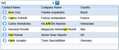
Display Formatting
Editor display values can be formatted using the standard formatting mechanism.
TextFormatString="{0} : {1} of {2}"

Multi-Column Mode
It's possible to represent the JmcComboBox's list data in several columns. This functionality is in effect if the editor's items collection is obtained from a data source. You can also define a column's header caption, width, visibility state and other settings for columns.
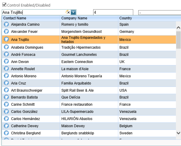
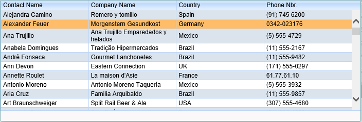
Multi-Selection Mode
It's possible to select multiple values.
Validation
The JmcComboBox control supports data validation server side, allowing you to implement any custom validation logic. If an editor fails validation logic, an error message can be displayed.


